

The right Christmas colors can transform your home into a warm, festive space without buying an entirely new set of decorations. Sometimes, a simple change in color is all it takes to make your holiday styling feel fresh and coordinated.
These christmas color scheme ideas for home will help you discover beautiful combinations for your living room, Christmas tree, bedroom, dining table, and entryway. From timeless red and green to elegant champagne and ivory, earthy terracotta and evergreen, and modern navy blue and gold, there is inspiration for different decorating styles and budgets.
Choosing a palette before decorating also makes shopping easier and helps prevent mismatched accessories. I’ve noticed that repeating just two or three colors across a room often creates a more polished look than adding lots of unrelated decorations. Explore these combinations, find the palette that suits your home, and discover simple ways to make your holiday decor feel intentional and inviting.
Table of Contents
Classic Red and Green
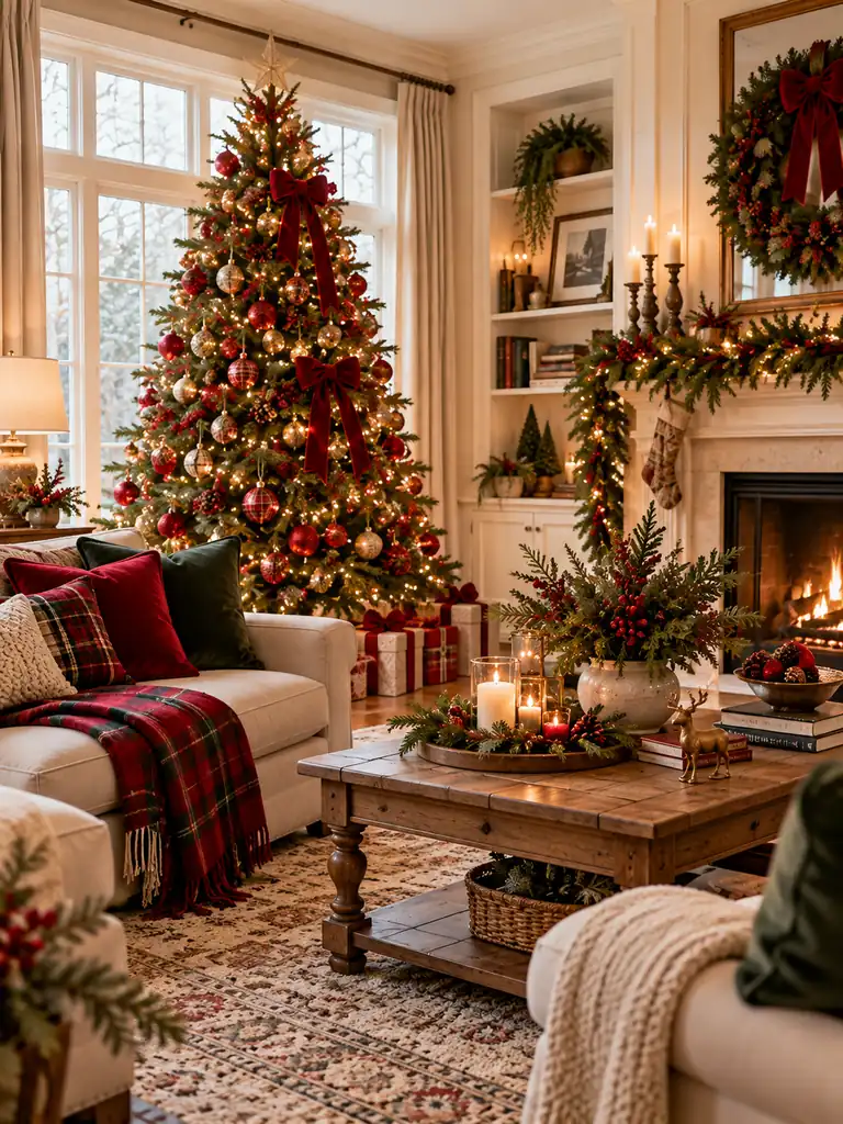
Red and green create a timeless Christmas look that feels festive without requiring an entirely new decorating style. Start with a green Christmas tree, then repeat red through velvet cushions, ribbon, stockings, or a plaid throw. Keeping the two colors consistent across the room helps the decorations feel connected rather than scattered.
For a more refined finish, choose deeper shades such as forest green and cranberry red instead of bright primary colors. Introduce natural wood, cream textiles, or brass details to soften the contrast. This classic combination works especially well in living rooms, entryways, and dining spaces where you want a welcoming holiday atmosphere.
For more inspiration on decorating a compact home for the holidays, explore these Christmas decor ideas for small apartments, with festive touches that work beautifully in smaller spaces.
Champagne and Ivory
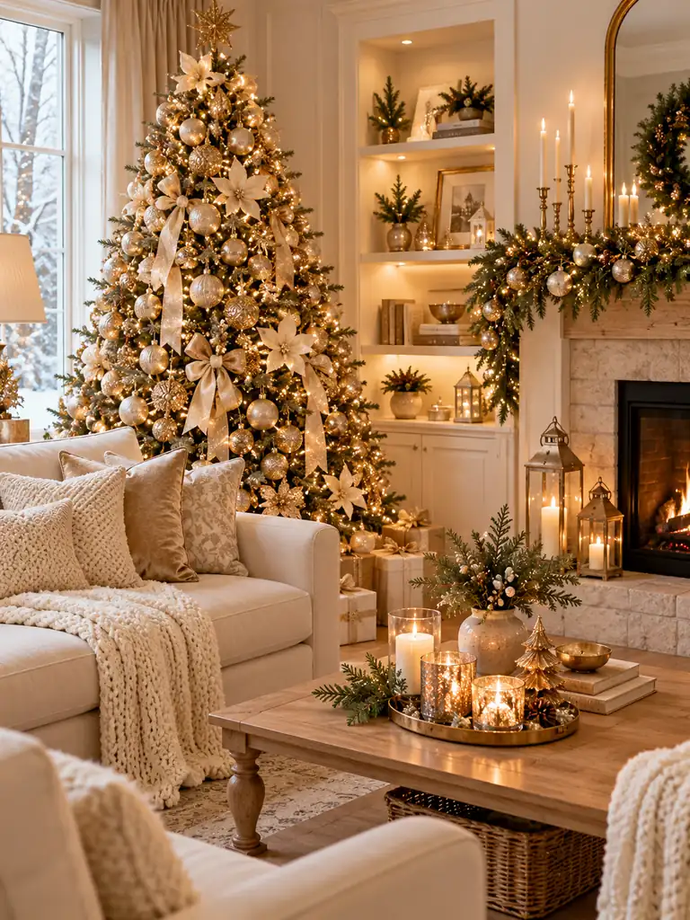
- Choose a warm foundation. Use ivory curtains, cream cushions, or a light neutral sofa to establish a soft background.
- Add champagne ornaments. Mix matte gold baubles with a few subtle metallic finishes for depth without excessive sparkle.
- Layer different textures. Combine chunky knits, linen, velvet, and faux fur to prevent the pale palette from feeling flat.
- Repeat metallic details. Use champagne candleholders, decorative trays, or ribbon to connect the tree with the rest of the room.
- Include natural greenery. A few evergreen branches bring contrast and keep the scheme from looking overly formal.
Champagne and ivory are especially effective in rooms with natural light, pale flooring, or neutral furniture. Choose warm-toned metals rather than icy silver, and keep reflective pieces balanced with soft fabrics. The result is an elegant holiday setting that feels calm, cohesive, and easy to maintain beyond Christmas Day.
Carry this soft, elegant palette into your sleeping space with these Christmas bedroom decor ideas for a coordinated holiday look throughout your home.
Navy Blue and Gold
Quick Tip:
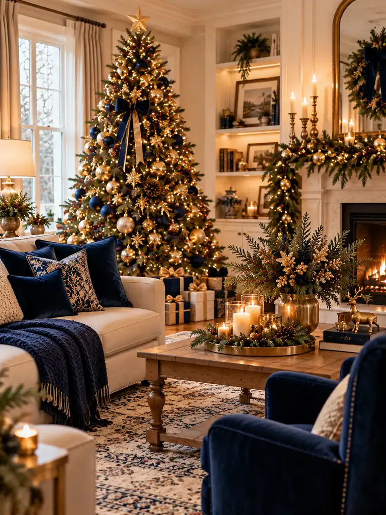
Use navy as the grounding color and gold as the accent. Start with navy cushions, a throw, or a few tree ornaments, then add brushed-gold candleholders and metallic decorations. Keep warm white lighting throughout the room so the dark blue feels inviting rather than cold.
Navy and gold create a sophisticated Christmas color scheme that works particularly well with neutral walls, dark wood, and traditional furniture. For a balanced look, distribute gold details around the room instead of concentrating them in one place. A few cream accents can soften the contrast and make the entire display feel more welcoming.
Burgundy and Blush
BEFORE
A room decorated entirely in bright red and green can feel visually busy, especially when the furniture and accessories already feature strong colors. The decorations may also lack a consistent connection with the existing interior.
AFTER
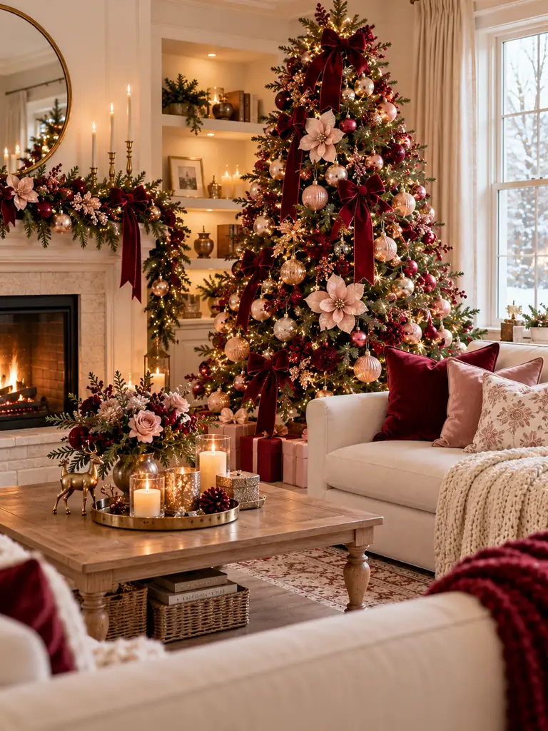
Deep burgundy paired with soft blush creates a more layered, sophisticated holiday palette. Burgundy velvet cushions, blush ornaments, and muted pink ribbons introduce contrast without making the room feel overly colorful.
For the best result, let burgundy provide the depth and use blush as a lighter accent. Add cream textiles and warm white lights to connect the shades. This combination works beautifully in living rooms, bedrooms, and Christmas tree displays where you want a romantic, polished look without relying on traditional bright red decorations.
Forest Green and Cream
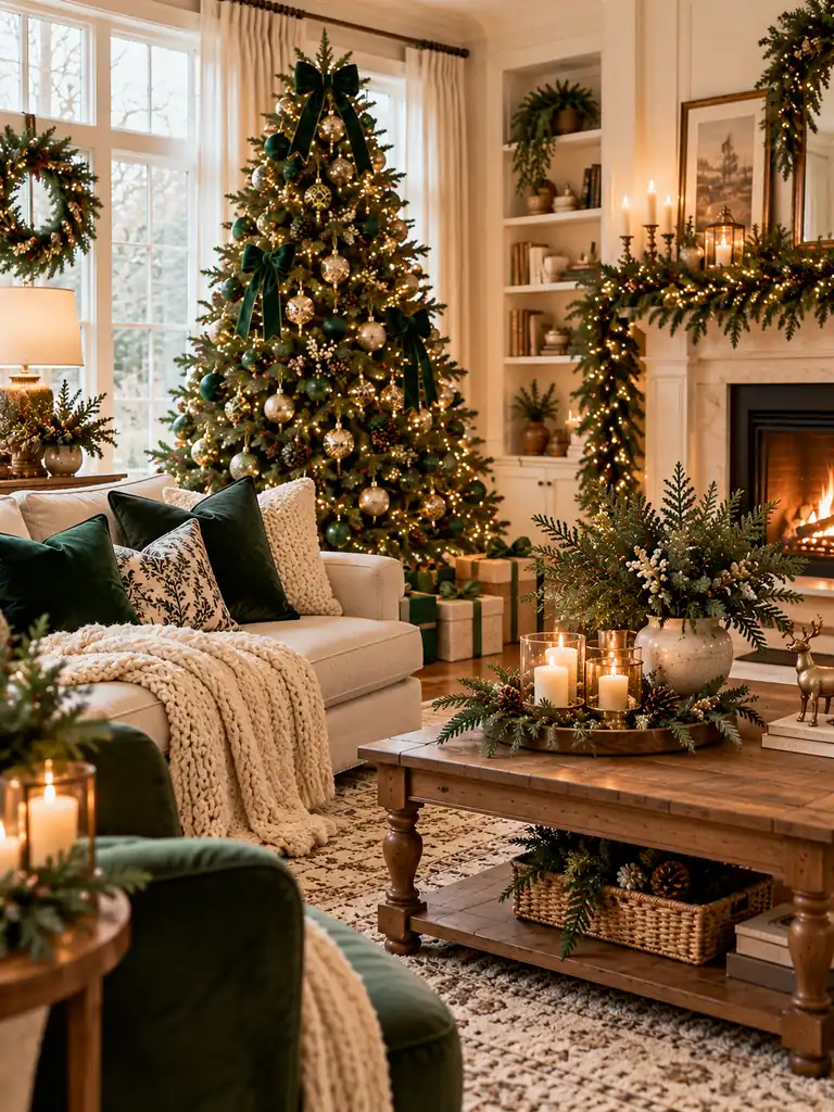
- Start with greenery. Choose a forest-green Christmas tree or evergreen garland as the main visual anchor.
- Layer cream textiles. Add ivory cushions, a chunky knit throw, or a cream table runner to soften the darker green.
- Bring in natural materials. Use wooden bowls, woven baskets, or linen accessories to create warmth and texture.
- Finish with gentle lighting. Warm white string lights and simple candles help the palette feel inviting after sunset.
Forest green and cream create a balanced combination that feels natural, cozy, and easy to coordinate with existing furniture. The darker green provides visual depth, while cream keeps the room feeling bright. In my experience, varying the textures matters more than adding extra colors, particularly when decorating a neutral living room for the holidays.
If you’re styling a smaller living area, these small apartment living room ideas offer more inspiration for creating a comfortable, well-coordinated space.
Silver and Ice Blue
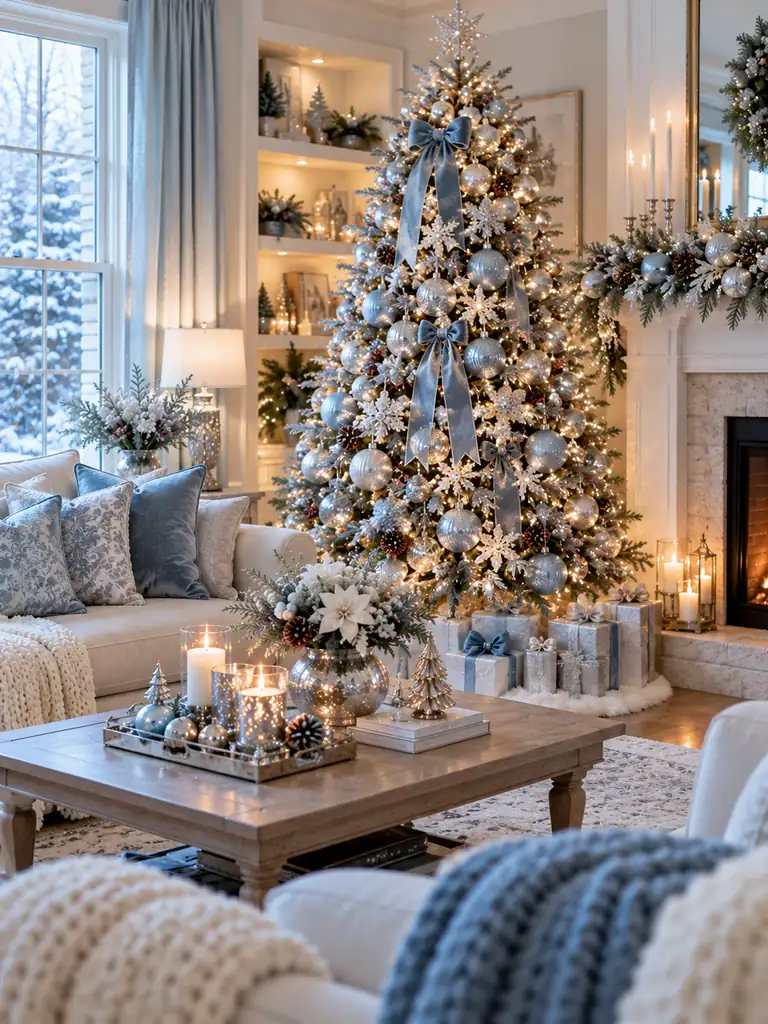
| Design Element | Option A: Silver Focus | Option B: Ice Blue Focus |
|---|---|---|
| Main decorations | Silver baubles and metallic garlands | Pale blue ornaments and ribbons |
| Textiles | Light gray cushions and ivory throws | Ice-blue cushions and white blankets |
| Overall effect | Polished and luminous | Soft and wintery |
| Best lighting | Warm white lights for balance | Neutral or warm white lights |
Silver and ice blue evoke a crisp winter look, particularly when paired with white textiles and lightly frosted greenery. Avoid filling every surface with reflective decorations, as too much shine can make the room feel busy. Instead, mix glass, matte finishes, and soft fabrics to create contrast while allowing the cooler colors to remain the focus.
Terracotta and Evergreen
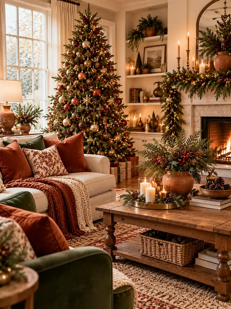
DO
- Pair terracotta cushions with deep green garlands or tree branches.
- Add clay vases, rust-colored ribbons, or ceramic candleholders for earthy warmth.
- Use cream or oatmeal textiles to soften the contrast between the two colors.
- Repeat terracotta in at least two areas to make the palette feel intentional.
DON’T
- Mix too many competing orange and red shades in one room.
- Use only dark accessories, which can make the overall palette feel heavy.
- Overload the tree with terracotta ornaments if the rest of the room is neutral.
- Combine too many metallic finishes with the earthy colors.
Terracotta and evergreen offer a fresh alternative to traditional Christmas colors, especially in homes with wooden furniture, woven baskets, and natural fabrics. The earthy orange adds warmth, while deep green keeps the decorations connected to the season. Use terracotta sparingly as an accent, allowing the greenery and neutral background to create balance.
Black and Gold
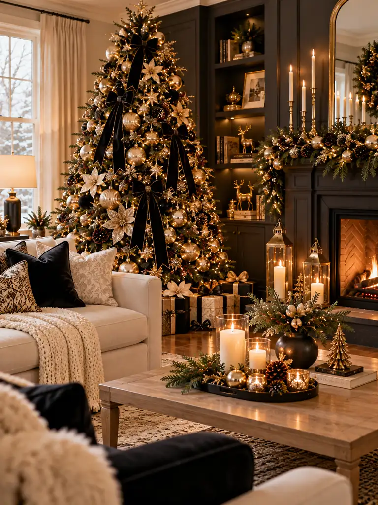
Cost: Moderate, depending on decorative accessories
Time: 1–2 hours to style a room
Skill Level: Beginner-friendly
Best For: Modern, contemporary, and glamorous interiors
Black and gold create a dramatic holiday palette that looks especially striking against light walls or natural wood floors. Use black in a few grounding details, such as ribbon, cushions, or candleholders, then introduce gold through ornaments, trays, and small metallic accents. The contrast gives Christmas decorations a polished, deliberate appearance.
To keep the room welcoming, balance the darker details with warm white lights and a few cream or ivory elements. Brushed or antique gold often looks more refined than highly reflective metallic finishes. This combination works particularly well on a decorated Christmas tree, mantel, or dining table where a few carefully placed accents can have a strong visual impact.
Dusty Blue and White
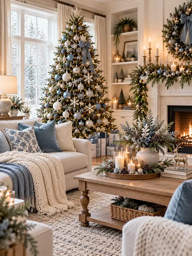
Dusty blue and white bring a soft, airy feeling to Christmas decorating without making the room look overly cold. Start with white as the foundation, then introduce dusty blue through cushions, tree ornaments, ribbons, or a cozy throw. The muted blue adds color while maintaining a light, uncluttered appearance.
For a more inviting finish, include natural wood, a little evergreen foliage, and warm white lighting. These details keep the cooler palette from feeling stark, especially in rooms with gray flooring or limited sunlight. Choose a consistent shade of dusty blue across the main accessories, then use white textiles to create breathing space between decorative elements.
Plum and Champagne
Cost: Moderate, depending on velvet accessories and metallic decorations
Time: 1–2 hours
Skill Level: Beginner-friendly
Best For: Elegant living rooms, formal dining spaces, and statement Christmas trees
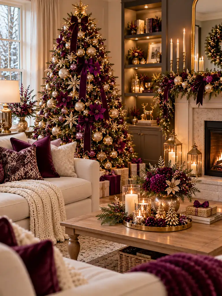
Plum and champagne create a rich, sophisticated combination that feels distinctive without relying on traditional red decorations. Use plum in velvet cushions, ribbon, or a few statement ornaments, then repeat champagne gold through candleholders, baubles, and decorative trays. The contrast between the deep purple tone and soft metallic accents adds depth.
Keep the surrounding colors simple so the palette remains cohesive. Cream upholstery, warm wood, and soft white lighting help balance the darker plum elements. For a coordinated look, repeat each color in at least two places around the room rather than concentrating every decoration on the Christmas tree.
Sage Green and Beige
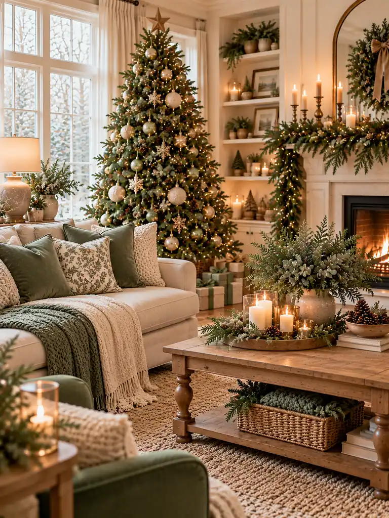
- Sage green accents: Use muted green cushions, velvet ribbon, or understated tree ornaments.
- Beige foundation: Start with sand-colored upholstery, linen curtains, or a neutral table runner.
- Natural greenery: Add eucalyptus stems, evergreen branches, or a simple wreath to reinforce the palette.
- Textural contrast: Combine linen, wool, woven baskets, and light wood to add interest without introducing more colors.
- Warm lighting: Choose soft white lights to keep the muted tones comfortable and inviting.
Sage green and beige suit homes that favor subtle seasonal styling over bold, colorful decorations. The muted green provides a Christmas connection, while beige keeps the overall look grounded and versatile. Repeat these shades across the tree, sofa, mantel, or dining table for a coordinated result that blends naturally with everyday neutral interiors.
Copper and Warm White
BEFORE
A room decorated with only white accessories and greenery can sometimes feel visually flat, particularly when most surfaces share similar neutral tones. Metallic details may also look disconnected when they appear in just one isolated spot.
AFTER
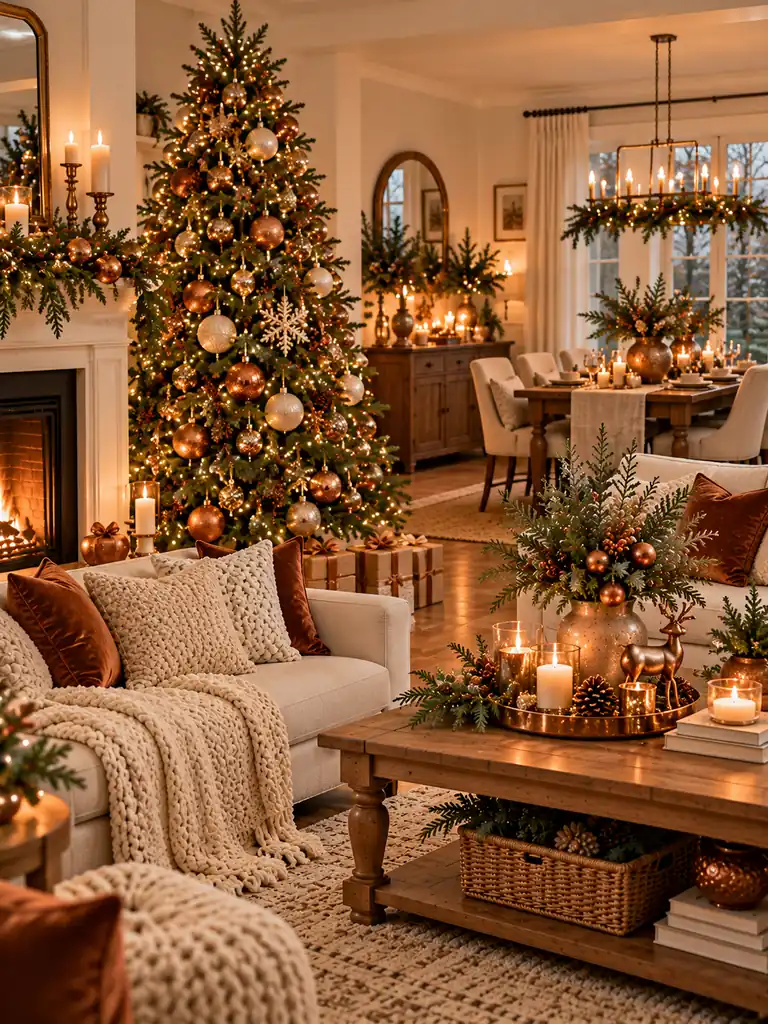
Copper introduces a warm, reflective accent that adds depth to a soft white Christmas palette. Copper ornaments, candleholders, or small decorative trays create subtle highlights, while cream textiles and warm white lights keep the setting relaxed.
For a cohesive finish, repeat copper across two or three areas, such as the Christmas tree, mantel, and dining table. Choose brushed or aged copper for a softer appearance, and avoid mixing too many metallic finishes. The result feels welcoming and polished without overwhelming a neutral room.
Chocolate Brown and Cream
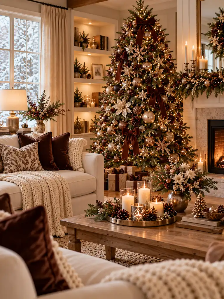
- Build the neutral base. Start with cream upholstery, beige curtains, or an ivory rug to keep the room light.
- Introduce chocolate brown. Add dark brown cushions, a velvet throw, or a few tree ornaments for depth.
- Layer natural materials. Use wood, wicker, linen, and wool to create a warm, textured finish.
- Add subtle festive details. Include evergreen garlands, warm white lights, and understated bronze accessories.
Chocolate brown and cream create a grounded, cozy Christmas palette that works especially well in homes with wooden furniture and neutral interiors. Cream prevents the darker brown from dominating, while natural greenery brings in a familiar seasonal element. Repeat both colors around the room for a coordinated look that feels warm rather than overly formal.
Emerald and Velvet Red
Cost: Moderate, depending on velvet accessories and ornaments
Time: 1–2 hours
Skill Level: Beginner-friendly
Best For: Traditional living rooms, formal entryways, and richly decorated Christmas trees
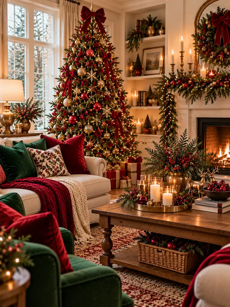
Emerald green and velvet red create a deeper, more luxurious take on traditional Christmas decorating. Choose rich jewel-toned green rather than a bright shade, then introduce red through velvet bows, cushions, or carefully spaced ornaments. The similar intensity of these colors helps the display feel deliberate and coordinated.
Balance the saturated tones with warm wood, cream accents, and soft golden lighting. Too many red and green accessories packed into one area can make the room feel crowded, so leave some neutral space between decorative pieces. This palette works particularly well when the tree, mantel, and soft furnishings share a consistent color story.
Soft Pink and Gold
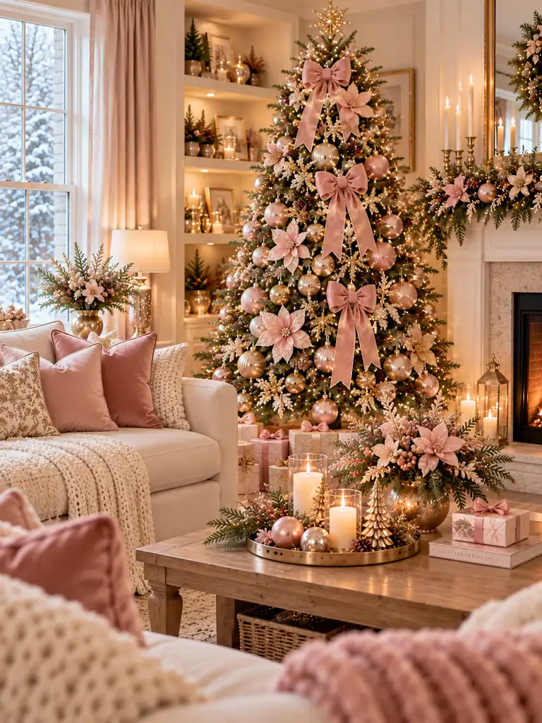
Soft pink and gold offer a delicate alternative to traditional Christmas colors, bringing warmth without relying on strong reds or greens. Start with blush cushions or pale pink ornaments, then add champagne-gold details through baubles, candleholders, and ribbon. Keeping the pink muted rather than overly bright makes the combination feel sophisticated.
For a balanced display, introduce evergreen branches and ivory textiles to connect the softer shades with the season. Choose a few gold accents and repeat them around the room instead of covering every surface in metallic decorations. This palette suits bedrooms, smaller living rooms, and Christmas trees where a gentle, elegant finish is the goal.
Rustic Brown and Evergreen
DO
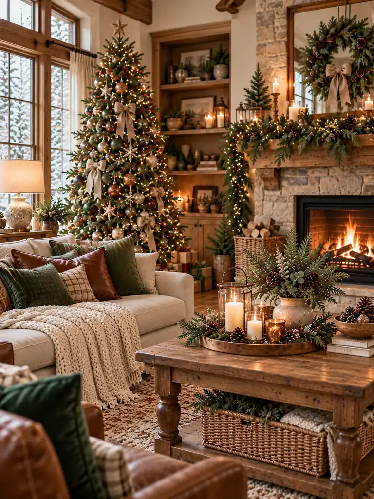
- Use natural wood, woven baskets, and brown leather or linen accents.
- Add evergreen garlands to the mantel, staircase, or dining table.
- Choose warm white lights to complement the earthy colors.
- Include a few handmade or wooden ornaments for a rustic finish.
DON’T
- Mix too many different wood tones without a connecting neutral.
- Overload the room with dark brown accessories.
- Use bright artificial greens that clash with the natural palette.
- Cover every surface with decorations; leave some wood and greenery visible.
Rustic brown and evergreen create a grounded Christmas look that feels connected to nature. The brown tones bring warmth, while deep green provides seasonal color and contrast. Keep the arrangement simple and focus on natural materials rather than shiny accessories. This combination works especially well in farmhouse interiors, cabins, and homes with exposed wood details.
Charcoal and Silver
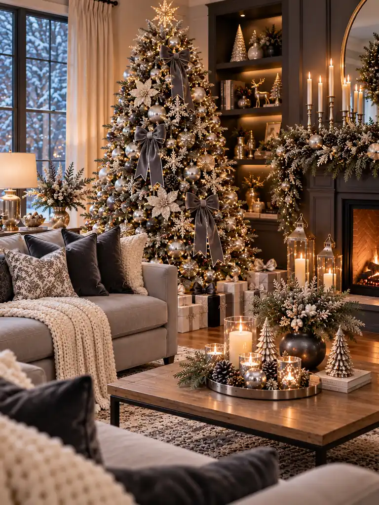
Cost: Moderate, depending on metallic ornaments and accessories
Time: 1–2 hours
Skill Level: Beginner-friendly
Best For: Modern apartments, contemporary living rooms, and minimalist holiday interiors
Charcoal and silver create a sleek Christmas palette with a cool, polished finish. Use charcoal through cushions, a throw, or a few decorative accessories, then introduce silver with tree ornaments, candleholders, and subtle metallic details. The contrast gives the room definition without requiring multiple strong colors.
To prevent the space from feeling too cold, add ivory textiles and warm white fairy lights. Matte charcoal finishes look especially effective beside reflective silver ornaments because the difference in texture adds visual interest. Keep the silver accents distributed throughout the room, and let the darker elements anchor the display rather than dominate it.
Cranberry and Natural Linen

| Design Element | Option A: Cranberry Focus | Option B: Linen Focus |
|---|---|---|
| Main accent | Cranberry cushions, ribbons, or ornaments | Natural linen runners and neutral textiles |
| Supporting details | Evergreen branches and warm white lights | Red berry stems and restrained greenery |
| Overall mood | Rich and festive | Soft and understated |
| Best placement | Christmas tree, mantel, or entryway | Dining table, sofa, or bedroom |
Cranberry and natural linen balance a rich seasonal red with soft, organic neutrals. Use cranberry as the accent rather than the dominant color, allowing linen, cream, and natural wood to keep the room light. A few berry branches or velvet ribbons can connect the palette across different areas without making the decorations feel repetitive.
Scandinavian White and Wood

A Scandinavian Christmas palette keeps decorations simple by combining crisp whites, natural wood, and understated greenery. Start with an evergreen tree, then add wooden ornaments, white paper stars, and a few cream textiles. The restrained color combination creates a bright, uncluttered appearance that works especially well in smaller homes and minimalist interiors.
- Choose pale wood: Use oak furniture, wooden ornaments, or simple decorative trays.
- Layer soft whites: Add ivory cushions, knitted throws, or a neutral tree skirt.
- Keep greenery natural: Use evergreen branches without excessive ribbons or shiny decorations.
- Use warm lighting: Choose warm white fairy lights to balance the cooler daylight and white surfaces.
The secret to this look is texture rather than lots of color. Combine smooth wood, soft wool, linen, and natural greenery so the room feels inviting instead of bare. Leave some surfaces undecorated, and repeat the same materials across the tree, mantel, and dining table for a cohesive Nordic-inspired Christmas.
Jewel Tones and Gold

Jewel tones bring depth and richness to Christmas decorating, especially when several saturated colors are balanced with gold accents. Begin with two main shades, such as emerald and sapphire, then introduce ruby red through smaller ornaments or velvet accessories. Gold candleholders and warm white lights connect the colors without making the display feel chaotic.
To keep the palette cohesive, repeat each chosen shade in more than one place. For example, match blue tree ornaments with a cushion, or coordinate emerald garland with a velvet throw. Let cream, beige, or natural wood provide visual breathing room, and avoid adding too many competing jewel tones to a small space.
Conclusion
Choosing the right Christmas palette can make holiday decorating easier, more cohesive, and much more enjoyable. These christmas color scheme ideas for home offer inspiration for everything from traditional red and green to soft neutrals, rich jewel tones, and natural Scandinavian styling.
Start with one combination that complements your existing furniture, then repeat its colors through ornaments, cushions, ribbons, greenery, and table accessories. You don’t need to redecorate your entire home to create a beautiful seasonal atmosphere; a few thoughtful changes can make a noticeable difference.
Save this article on Pinterest, try your favorite color combinations, and share it with friends who love decorating for Christmas. Let your home reflect your own festive style!
8 thoughts on “20 Christmas Color Scheme Ideas for Home That Look Stunning”